Intake
The practice, the patients, the competitors, and what it must never become.
01_(brand design for medicine and healthcare)
I design brands for doctors, clinics and health businesses. Diagnosis before design, a five-stage method with a defined end, and four brands below you can inspect from the first decision to the last file.

Fields I have worked in: physical therapy, facial plastic surgery, gastroenterology, general practice, aesthetics and healthtech.
(the problem)
A patient decides who to trust before they can tell whether you are good. The brand is what answers for you in that moment.
(the thesis)
The market filled up with instant visual identity. The result is everyone looking like everyone else, generated in the same tool, converging on the same average.
My job is not to generate options. It is to decide. Positioning diagnosis, competitor analysis, compliance with the medical advertising rules that most designers have never read, and the choices that make a brand unmistakable.
Healthcare is also where the constraints are real. A brand for a surgeon cannot promise outcomes, cannot use before-and-after the way a beauty salon can, and still has to look expensive. That is a design problem, and it is the one I have chosen to be good at.
I use AI in the process, and I use it well. It gives me speed. The judgment stays human, and signed.
(the method)
No good doctor prescribes without taking a history first. No strong brand is born without one either. The Souza Protocol treats a brand the way a doctor treats a patient: listen first, diagnose with criteria, prescribe with strategy, treat with precision, and discharge with autonomy.
listen
read
decide
build
hand over
The practice, the patients, the competitors, and what it must never become.
01_The real perception problem, named. Where the brand blurs into every other one.
02_Territory, personality and language. What the brand is, and what it is forbidden to be.
03_The identity takes shape. You follow the decisions, not just the result.
04_Manual, source files and a trained team. No permanent dependency.
05_(patients)
Each one came out of a diagnosis, not a template. Every case below shows the reasoning, not only the result.
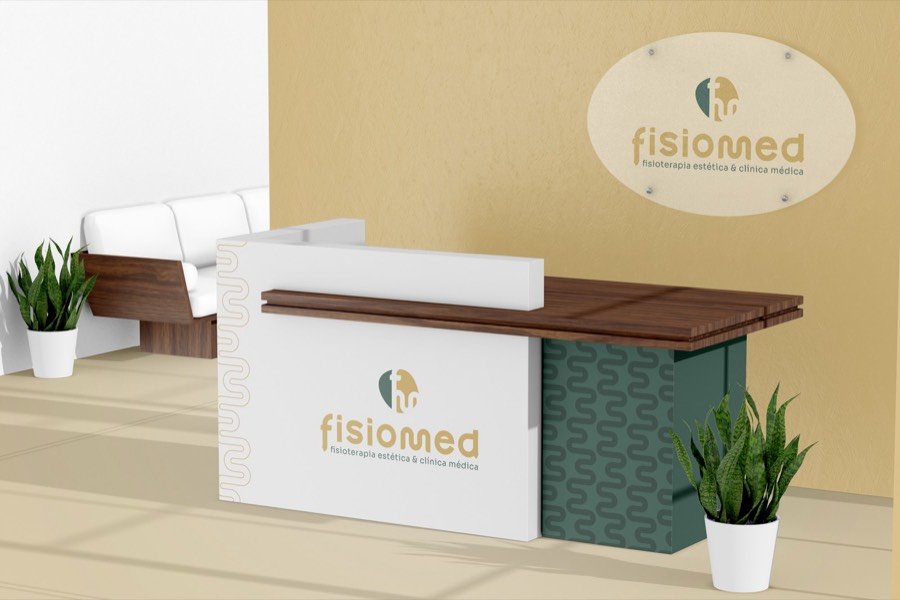
patient no. 001 · physical therapy and general practice
diagnosis Perception split between aesthetics and clinical medicine.
outcome One system holding both natures without becoming two companies.
read the case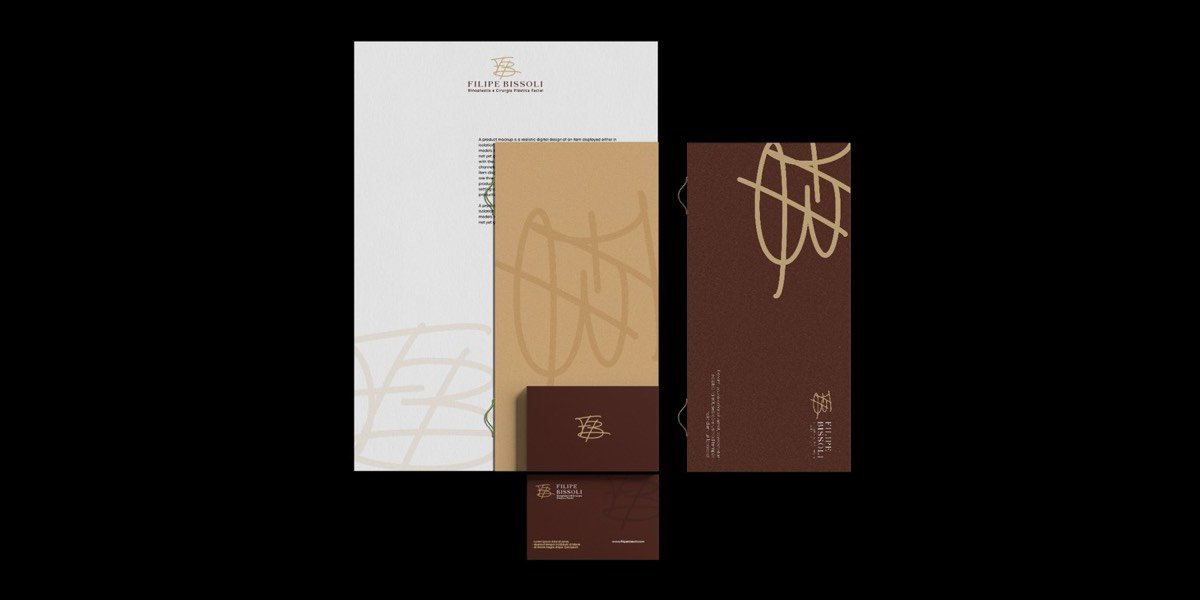
patient no. 002 · rhinoplasty and facial plastic surgery
diagnosis High-end surgery presenting itself like an ordinary practice.
outcome An original monogram and a system that justifies the price before the consultation.
read the case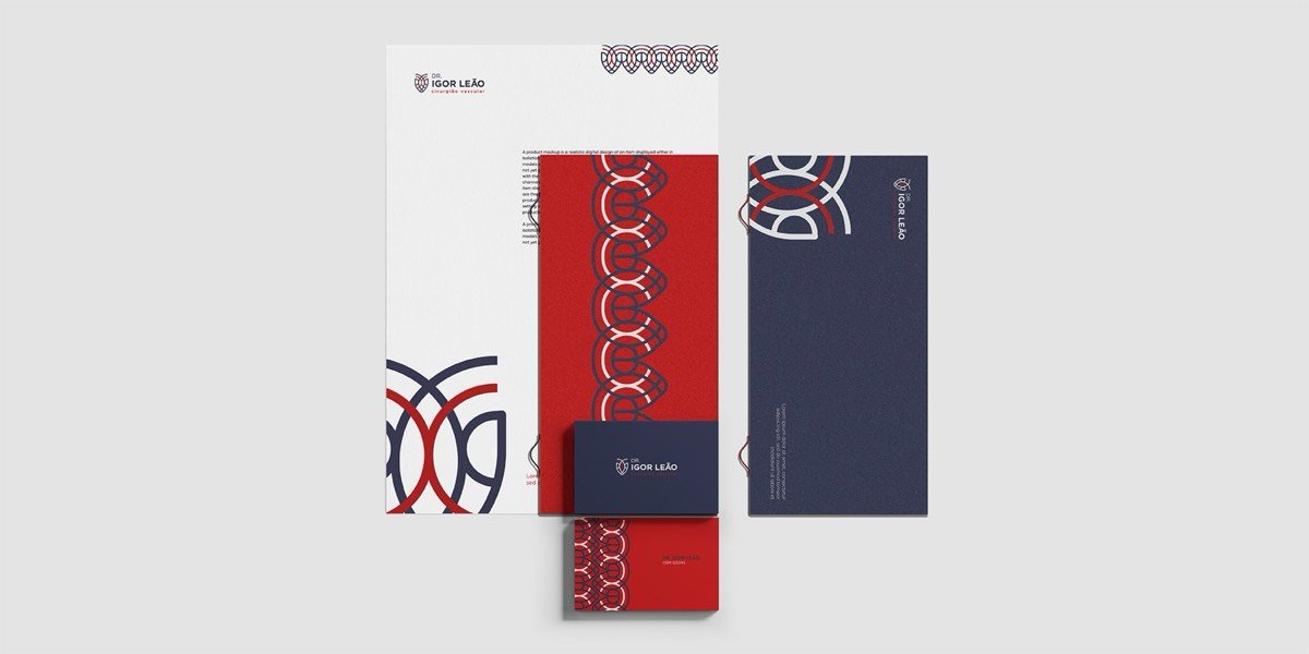
patient no. 003 · vascular surgery
diagnosis A technical specialty with no symbol to make it memorable.
outcome A vessel symbol that became a pattern and carries the brand on its own.
read the case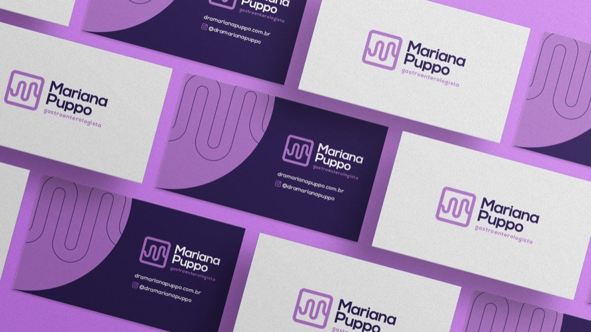
patient no. 004 · gastroenterology
diagnosis A field that is hard to look at, needing to be communicated without embarrassment.
outcome A symbol that suggests the organ without being literal, in a palette that welcomes.
read the case
(who signs it)
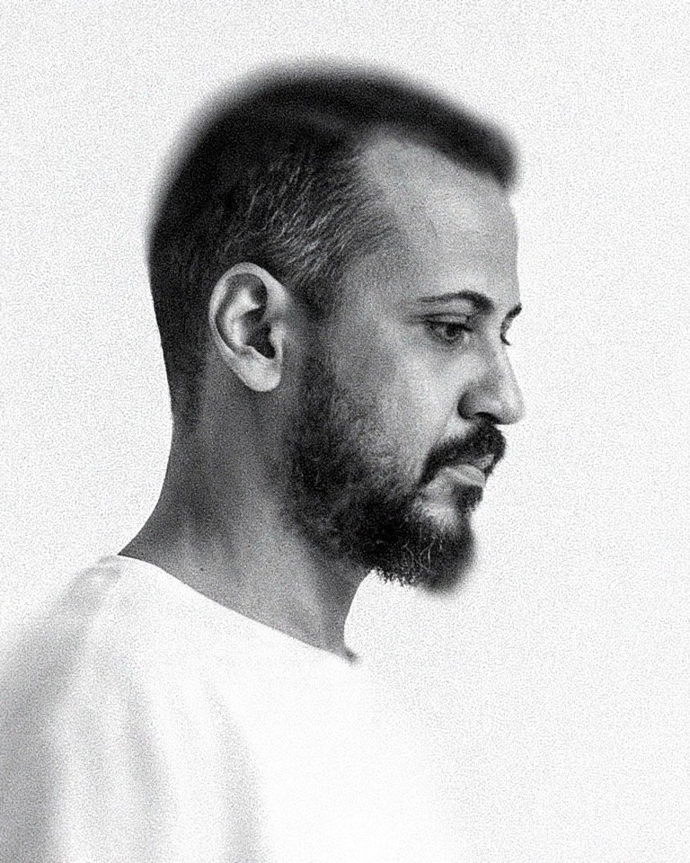
Designer by training, strategist by experience. More than a decade building brands and leading marketing, and in recent years integrating AI into the creative process for real, not as decoration on a proposal.
I chose healthcare because it is where a brand stops being decoration and becomes trust. And trust is the first thing a patient buys.
Based in Brazil, working remotely. Every case on this site was run end to end by me: the diagnosis, the decisions and the files.
Viny Souza
(the door)
Tell me what you need and I answer personally.
The first consultation is on me.