(patient no. 001)
Two natures under one roof. One brand that holds both.
FISIOMED is aesthetic physical therapy and general practice at the same time. Brands like this usually pick a side and lose the other. The work here was building a system that holds both without becoming two companies.
- Brand manual
- Full stationery
- Signage
- A card per practitioner
(the course of treatment)
The Protocol applied to this patient.
The same five stages, intake to discharge, now with what actually happened inside each one.
-
01_ intake
Listening first
- Two audiences that barely overlap
- More than one practitioner signing
- What the clinic refused to be: neither a spa nor a public health post
-
the turning point
02_ diagnosis
A split perception
The problem was not the absence of a brand. Pulled toward aesthetics, the clinic lost its medical authority. Pulled toward clinical, it lost the warmth that brings an aesthetics patient back.
-
03_ prescription
Territory in the middle, on purpose
Care with competence. A green of clinical calm and a gold of welcome, with neither one dominating. Open-stroke typography, to take out the coldness without taking out the seriousness.
-
04_ treatment
The symbol, and what came out of it
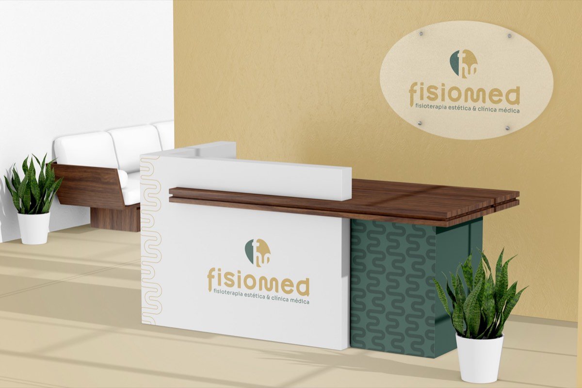
The letters F and M fused into an abstract shape suggesting body and movement, inside a circular outline that closes the set. Out of the symbol came a continuous-line pattern that became the personality layer of the system. It runs along the side of the reception desk, the edge of the notepad and the back of the cards, and it is what makes the brand recognisable even when the logo is nowhere in sight.
-
05_ discharge
Handed over with autonomy
- Manual with grid, minimum size and misuse rules
- Vector files in every format
- Stationery, email signature and signage
-
Two practitioners share the same premises. Each got their own card, with their name leading and the clinic brand as the base. That is the real test of a brand system: growing without breaking.
(the system)
What was documented.

core palette
type and rules
(in use)
The brand in use.
From the reception desk to the lab coat, the same system, with nothing improvised. Click any piece to enlarge.
(the door)
If your practice also serves more than one world, the diagnosis comes before the drawing.
The first consultation is on me.