(patient no. 003)
A specialty nobody knows how to draw. Now it has a symbol.
Vascular surgery is technical, quiet and hard to illustrate without falling into the cliché of a heart or a diseased leg. The work was finding a shape that says vessel without saying disease.
- Original symbol
- Woven pattern
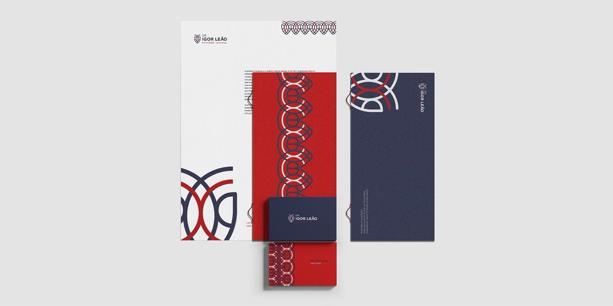
- Stationery
- Social media
(the course of treatment)
The Protocol applied to this patient.
The same five stages, intake to discharge, now with what actually happened inside each one.
-
01_ intake
Listening first
- A technical specialty with low public exposure
- Patients arrive by physician referral
- What it could not look like: a generic hospital
-
the turning point
02_ diagnosis
No symbol, no memory
The specialty had no image of its own. Without a symbol you can recognise from a distance, the brand depended on the written name, and a written name does not survive on a badge, a lab coat or a story.
-
03_ prescription
The two codes that already exist
Navy for clinical trust and red for arterial blood. These are the only two codes the specialty already carries in the mind of whoever walks in, so the treatment was to use them precisely instead of inventing a third.
-
04_ treatment
Two arcs that cross
The symbol is two arcs that cross and form, at the same time, the drawing of a vessel and the outline of a shield. Repeated side by side, those same arcs become a woven pattern covering stationery, envelopes, lab coats and the feed. That pattern is what carries the brand wherever the wordmark does not fit.
-
05_ discharge
Handed over with autonomy
- Brand in horizontal, vertical and symbol lockups
- The woven pattern as an editable file
- Stationery, envelopes and social templates
-
The test of a symbol is whether it works alone. On the social pieces and on the lab coat pocket, the wordmark disappears and only the crossing of the arcs remains. The brand is still recognised.
(the system)
What was documented.

core palette
brand rules
(in use)
The brand in use.
Click any piece to enlarge.
(the door)
If your brand is not answering for you, we should talk.
The first consultation is on me.